
Nearly half of mobile app users uninstall within 30 days, and the fix is not more features. Five architectural decisions consistently separate the apps people keep from the ones they delete: giving value before asking for anything, preserving spatial context with the right modal patterns, using AI as an invisible quality guardian, designing for distracted micro-tasking users, and treating accessibility as a performance multiplier that benefits everyone.
Nearly half of all mobile app users uninstall within 30 days. The majority of those uninstalls happen in the first 24 hours. In developing markets, that attrition rate climbs past 65%.
Most product teams respond to this by adding features. More onboarding screens. More tutorials. More reasons to stay. But after years of leading product teams through these exact conversations, the pattern I keep seeing is the opposite: the apps that retain users are the ones that remove friction, not the ones that pile on value propositions.
The root cause is almost always the same. Teams build for the spec, not for the person. They stop asking the simplest question in product development: would I actually use this? Not “does this meet the requirements,” but would I open this app a second time? Would I recommend it to someone? What would make me think “that’s cool” instead of reaching for the uninstall button?
That question is the entire discipline of user empathy compressed into a single gut check. And the answers it produces are remarkably consistent: keep it simple, keep it fast, keep it valuable. Every decision that violates one of those three principles is a decision that pushes someone closer to deleting your app.
Retention is not a feature problem. It is an architecture problem. The decisions that determine whether someone keeps your app happen long before they reach your core functionality. They happen in the first few seconds, in the mental model your interface creates, and in the invisible assumptions your team made about how people actually use their phones.
Here are five truths about building products people keep, drawn from the patterns that consistently separate the apps that survive from the ones that get deleted before lunch.
Why Should You Give Value Before Asking for Anything?
The single biggest point of failure in most apps is the front door. Traditional onboarding is a taking mechanism. It demands your email, your permissions, your phone number, and your account creation before you have seen a single screen of value. From the user’s perspective, you are asking for trust you have not earned.
The fix is straightforward, but it requires a mindset shift most product teams resist: give first, ask later. Let someone experience your core feature before you ask them to create an account. Let them see what the app does before you request location access. Treat onboarding as an exchange, not an intake form.
The best performing apps limit this initial flow to four steps or fewer. Not because four is a magic number, but because every additional step is a moment where someone can decide “this is not worth it.” And they will. The data backs this up, but you do not need data to understand it. Think about your own behavior. When was the last time you happily filled out a registration form before knowing whether an app was useful?
I am from the Show Me State. You have to show me, not just tell me. That is how every user thinks, whether they are from Missouri or not. Your users are not going to take your word for it that your app is valuable. They need to see it, touch it, and experience it before they will give you anything in return. Demonstrate value to earn the right to send push notifications. Demonstrate value to earn a spot on someone’s home screen. Be useful in the first thirty seconds, or do not be surprised when you are gone in sixty.
Skip the tutorial overlays. Skip the feature walkthrough. If your product cannot communicate its value through the experience itself, no amount of onboarding slides will save it.
2. Full Screen Modals Break Your Users’ Mental Model
There is a pattern I see in nearly every product review: a team discovers that users are not completing a key workflow, so they throw it into a full screen modal to “force focus.” It seems logical. Remove distractions, direct attention, drive completion. In practice, it often makes things worse.
Full screen overlays trigger what I call context loss. The user feels like they have been transported to an entirely new page. The return path feels uncertain. The relationship between what they were doing and what they are now looking at becomes unclear. Instead of focusing, they hesitate. Instead of completing, they abandon.
The right container depends on the user’s mental state, not the designer’s intention:
| Modal Type | Best For |
|---|---|
| Centered Overlay | Brief, context aware tasks: alerts, confirmations, short forms where the user needs to keep the underlying screen in view |
| Full Screen | Deep work requiring total isolation: multi step editors, 3D configurators, complex creation flows where there is nothing to reference behind it |
| Slideout Pane | The middle ground: enough room for a detailed task while preserving the primary screen’s context |
The slideout pane is the one most teams underuse. It is particularly valuable for power users who need to reference data on the main screen while completing an action in the panel. If you have ever used a CRM where clicking a record opens a side panel instead of navigating away, you have experienced why this pattern works.
The principle underneath all of this is simple: never break your user’s sense of place unless the task genuinely requires it.
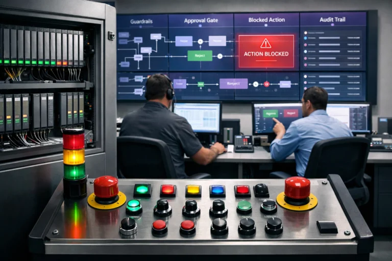
Can AI Serve as a Real-Time Quality Guardian?
Most teams think of AI in their product as a chatbot or a recommendation engine. Something the user interacts with directly. But some of the most effective AI implementations I have seen are invisible. The user never knows AI is involved. It just quietly makes the experience better.
One example that changed how I think about this is the Les Herbonautes project, a citizen science initiative digitizing the French National Herbarium. Thousands of volunteers transcribe handwritten botanical labels into structured data. The error potential is enormous: misread dates, impossible geographies, species names with dozens of valid spellings.
Rather than catching errors after submission and sending them back for correction (the traditional approach), the system uses handwritten text recognition and OCR to analyze labels in real time. If a volunteer transcribes a collection date that is chronologically impossible for a specimen, or enters a geography that contradicts the label’s metadata, the system flags it instantly. The correction happens in the moment, not days later in a review queue.
This is the shift from post entry validation to real time correction, and it applies far beyond botanical records. Any product where users input data that needs to be accurate (and that is most products) can benefit from this pattern. The key insight is that AI works best here not as a replacement for human judgment, but as a guardrail that catches mistakes before they compound.
To be clear, the visible stuff matters too. A polished chatbot signals competence. A modern, well maintained interface tells users you take the product seriously. If your website looks like it was built during the AOL era, that communicates something about how you treat your users. But the invisible AI layer, the one quietly keeping data clean and users confident, is where the retention math actually changes.
4. Design for the Distracted, Not the Ideal
There is a comfortable fiction in product development: the user sitting at a desk, fully engaged, giving your app their complete attention. That user does not exist. The real user is buying a train ticket while walking, finding a restaurant with one hand while holding a coffee, or scrolling through your app in a waiting room because they have nothing better to do.
Mobile users operate in three psychological states: micro-tasking (get something done fast), local (find something nearby), and bored (kill time). Your interface has to survive all three, and the one that will punish you fastest is the micro-tasker.
I think of this as the Shazam principle. Shazam understood something most apps still get wrong: identify the single most urgent action your user needs and make it available with zero friction. Open the app, hit the button, get the answer. Everything else is secondary. For a micro-tasking user, any secondary noise is not a feature. It is a barrier to the thing they came to do.
This extends to performance in ways most teams underestimate. Speed is not just a technical metric. It is a psychological one. Research shows that if your app loads in under two seconds, users perceive the delay as about 15% longer than reality. If it exceeds two seconds, the perceived delay feels 35% longer. Past three seconds, you are losing people. Not because they made a rational decision to leave, but because their brain already moved on.
When product teams ask me where to invest next, my answer is usually boring: make it faster. Speed is the single most undervalued retention feature in most product backlogs.
5. Accessibility Is a Performance Multiplier
Accessibility gets pitched as a compliance requirement, and that framing is exactly why most teams underinvest in it. When the conversation starts with “we need to meet WCAG standards,” the energy in the room drops. It sounds like checkboxes and legal cover.
Here is what I have learned working with product teams: the features you build for your most sensitive users make the experience better for everyone. That is not a feel good statement. It is a measurable performance gain.
UI patterns designed for neurodivergent users, people who are sensitive to clutter, unexpected motion, or information overload, produce interfaces that are cleaner, faster to scan, and easier to use in exactly the conditions where most people actually use their phones. Bright sunlight. Low bandwidth. One handed while carrying groceries. The “edge cases” you design for turn out to be the everyday cases your typical users never complained about but silently struggled with.
The practical checklist is short and the impact is disproportionate:
- Touch targets: minimum 44pt on iOS, 48dp on Android. This is not about accessibility audits. It is about preventing the “fat finger” mis-taps that frustrate every user on every device.
- Modern image formats: WebP and lazy loading give you instant visual feedback without the bandwidth penalty. Users feel the speed even if they cannot name why.
- Reduced motion: Linking a reduced motion toggle to system level settings decreases cognitive load and makes navigation feel faster for everyone, not just those who need it.
- Predictable anchoring: Keep primary actions like Cart, Search, and Home in fixed, familiar positions. Every time a user has to hunt for a button, you are spending their patience.
Build for the most constrained user and you build a faster, simpler product for all of them.
The Bottom Line on Building Apps People Keep
The pattern across all five of these truths is the same: retention is not about giving users more. It is about respecting the time, attention, and trust they are already giving you. Show them value before asking for anything. Preserve their sense of place. Let AI work quietly in the background. Design for the person on the sidewalk, not the person at the desk. And build for your most constrained users, because that is how you build something that works for all of them.
None of this is complicated. But it does require a product team that is willing to ask the uncomfortable question: would I actually keep this app on my phone? If the honest answer is no, the roadmap needs to change before the feature list does.
Struggling with app retention and looking for product architecture guidance? I can help.
Product architecture decisions compound over time. See how resilience becomes a product decision.
Related Posts

Why AI Pilots Matter Before Full Rollout
Your Agentic AI Is Not Evil, It Is Just Over-Permissioned